“SPOT FINDER”
Select a target environment where a problem is identified and find areas that can be improved. Conceptualize a product that could fix those issues.

Timeline: 3 weeks, 30+ hours
Role: UX/UI Designer
Term: Spring 2022
Tools: Figma, Adobe Illustrator, Adobe Photoshop
INTRODUCTION
As the objective of the redesign project, I wanted to address parking issues in San Francisco to develop a comprehensive plan that improves the efficiency, accessibility, and affordability of parking facilities. I decided to design a parking app to provide a user-friendly platform that helps drivers quickly and easily locate available parking spots in San Francisco. The app should integrate real-time data on parking availability, pricing, and restrictions to provide accurate and up-to-date information to users. The goal is to simplify the parking process, reduce congestion, and save time and frustration for drivers searching for parking in the city. Additionally, the app should improve the overall parking experience for users by providing a seamless, convenient, and efficient way to find and reserve parking spots.
PROBLEM #1
UNBELIEVABLY DIFFICULT TO FIND A PARKING SPOT
RESEARCH
Parking in San Francisco depends on various factors:
● Neighborhood
Entertainment neighborhoods (Cow Hollow, North Beach, Castro, Mission, etc.) have fewer chance of finding a parking spot.
● Time of the day
7:00-9:00 AM and 4:00-6:00 PM are the most challenging times to find parking.
● Day of the week
Mondays through Fridays are more challenging days to find parking than weekends.
Source : https://www.sfcta.org/projects/san-francisco-parking-supply-and-utilization-study
IDENTIFICATION

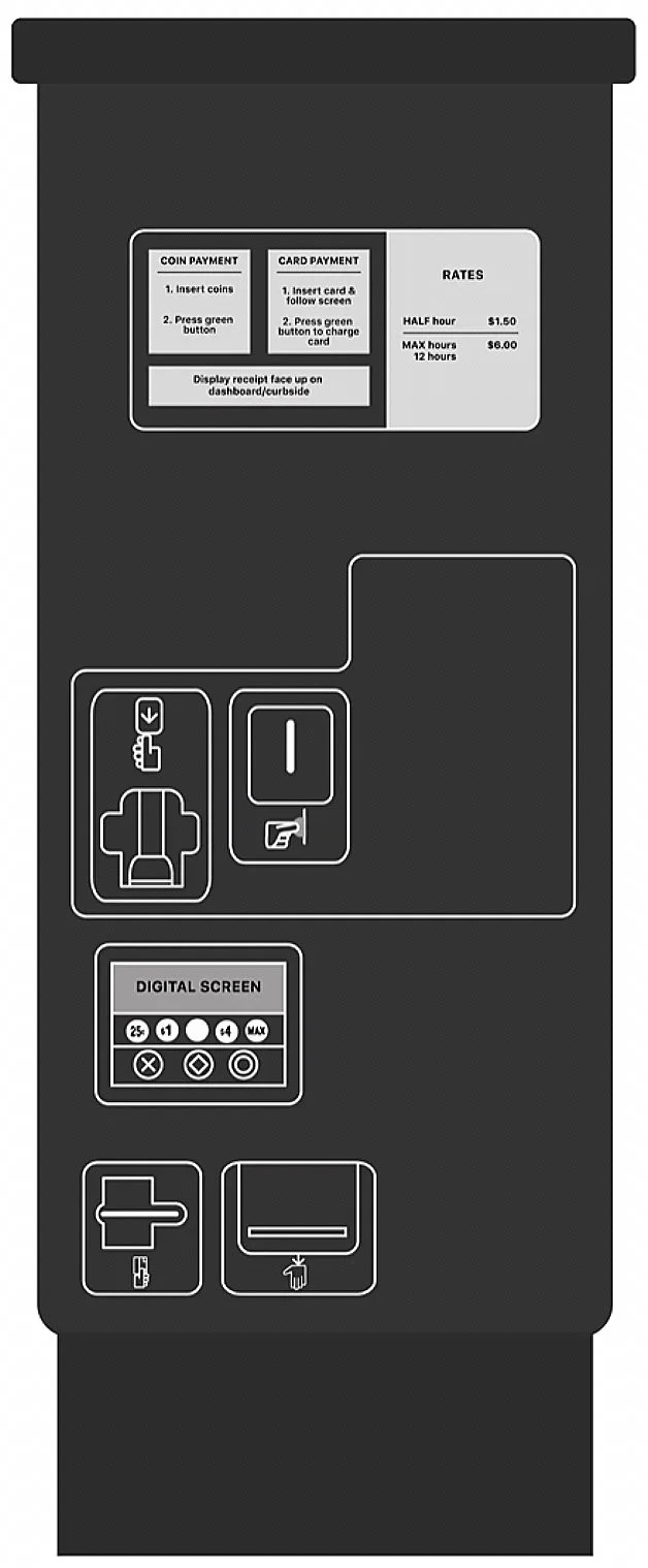
After finding the perfect parking meter to analyze, I used the four affordances of design - procedural, participatory, encyclopedic, and spatial - to understand its interface.
Procedural: The machine provides a parking ticket based on the specific time paid for. Payment can be effected using coins or cards based on the price per hour listed on the board beside it.
Participatory: The user’s goal is to pay for the desired parking time in the building complex. The building is next to the Cooksville GO Station. Therefore, it is generally used during peak rush hours when the GO station parking lot is full.
Encyclopedic: There aren’t many instructions given on the actual interface (limited to “insert card” and “take a ticket”). However, there is a paper instructional guide pasted on top of the machine and on a large board with minimum and maximum rates for parking.
Spatial: It isn’t easily accessible as it is located on a steep step, so people using wheelchairs/ mobility aids may be unable to access the machine's upper half. There is a parking space less than a meter from it, so it is difficult to access when the area is fully parked.

ANALYSIS
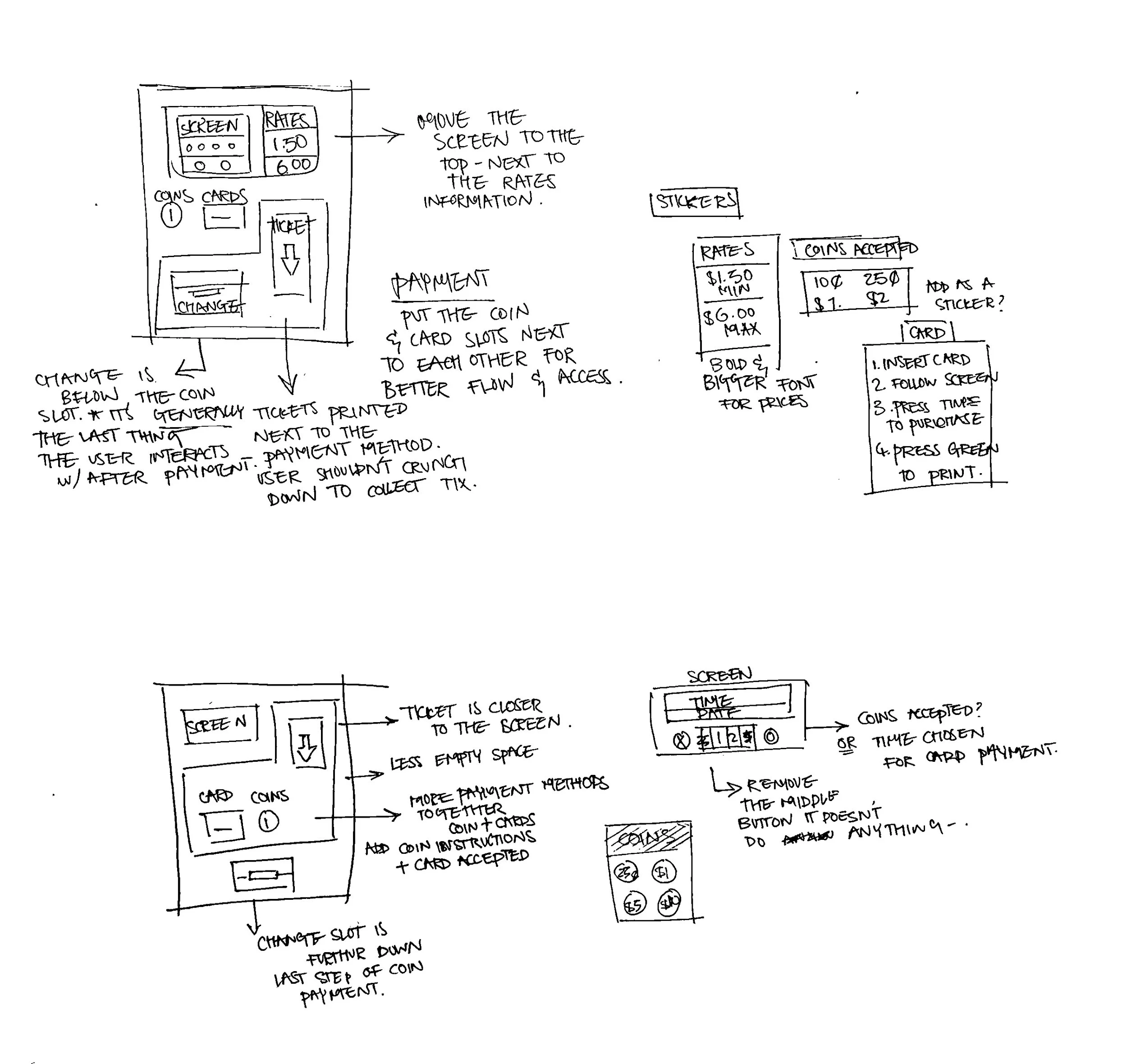
I illustrated a digital version of the parking machine so that I could edit & move components around for proposed design solutions. Also, this helps me visualize the basic layout of the interface.
There is a lot of empty space on the right of the coin slot and on the right of the digital screen. I have pointed out and numbered some parts of the interface that could be improved using the four design affordances. These issues range from mild inconvenience to hindering functionality.
Lack of instructions: The rates are displayed on a separate board next to the machine and on a wrinkled piece of paper on the machine, and the only thing to signal a payment process is a muted green button on the screen.
Accessibility: The level of the main screen is far too low to access. Since a user needs to see how many hours have been purchased and confirm the payment, they would be crouching most of the time.
Lack of flow: There isn’t an easily identifiable machine using “flow”: paying at the bottom of the machine, selecting at the top of the machine, and then returning to the bottom again.
Paper or screen?: The larger screen at the top feels like it “should” be the digital screen. But instead, it’s a piece of paper instructing coin or card payments. Additionally, the readability of the paper is quite bad.
SOLUTION AND USABILITY IMPROVEMENT #1
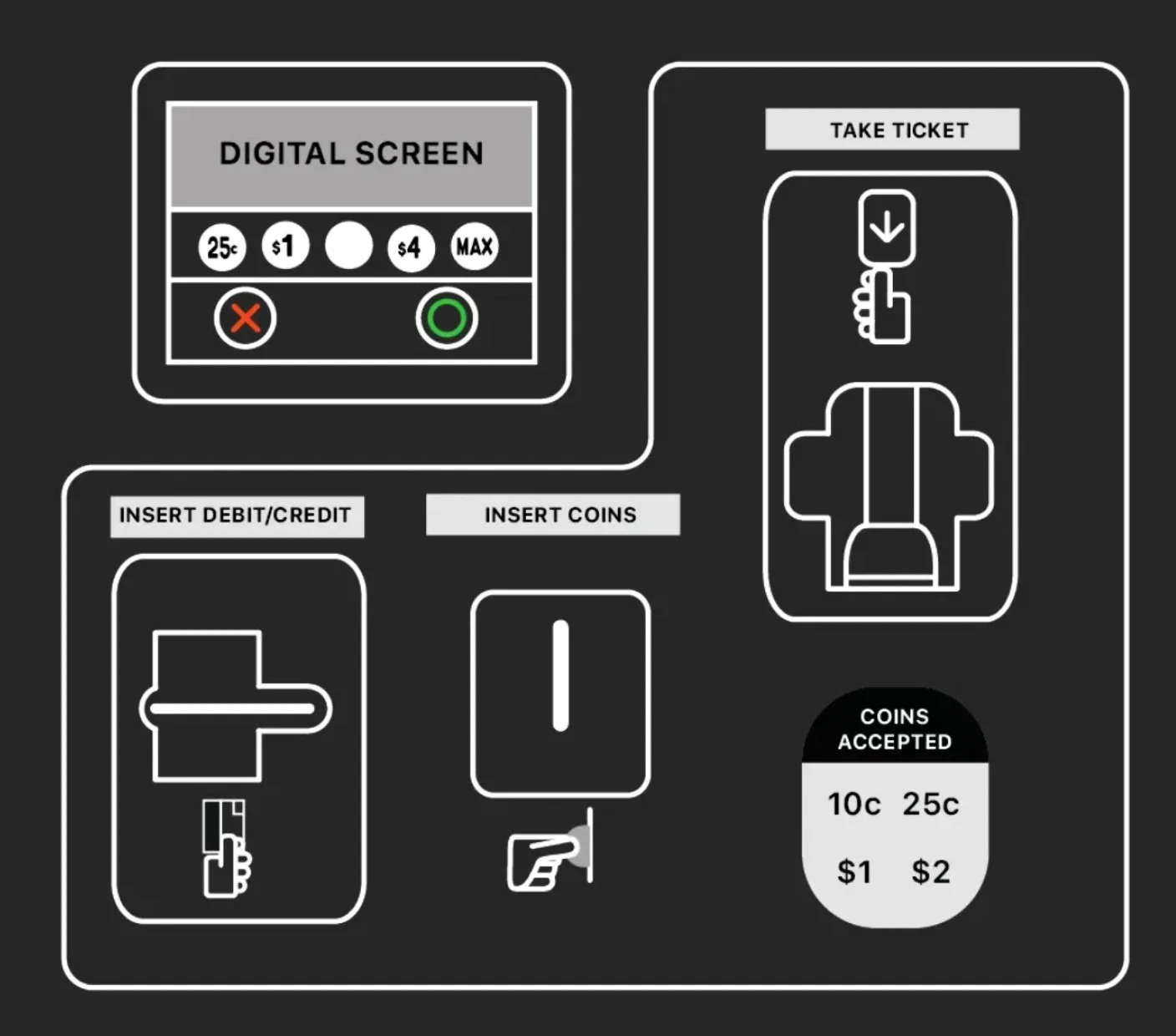
Removing buttons that don’t work, providing clearer payment instructions, and adding better instructions to the interface.
A more minor change to the interface would include adding coins accepted and moving payment options together so that it appears more compact, rather than spreading out the 2 payment options far away from the digital screen.
USABILITY TESTING
SOLUTION AND USABILITY IMPROVEMENT #2

Moving the screen to the top paper frame, Adding stickers, labels, and instructions toward the payment methods, and Moving payment options closer together.
A bigger interface change includes moving the digital screen to the top of the machine, which makes sense from the user’s perspective, especially if the parking rates are displayed next to the frame.
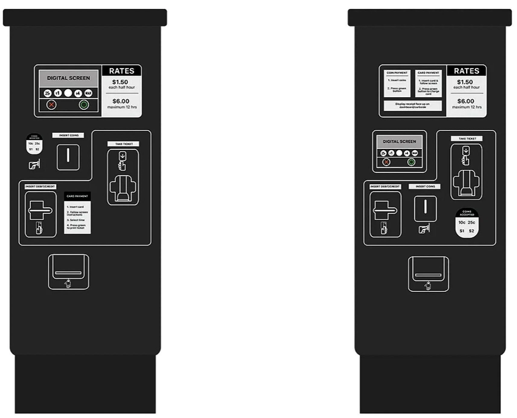
Two different design solutions involving multiple changes: the one on the left requires more drastic changes, moving the screen to the top of the meter and re-arranging payment methods, whilst the design on the right involves shuffling the order of the payment methods and adding instructional stickers.
Without adding new digital features, I arranged the screen to be located above all the payment methods. Since a user will be going back and forth from the card payment slot to the screen — as shown in the user flow above, it seems logical to place them closer together, especially since it was pretty far from each other initially. Previously, the ticket slot was on the first row on the far left. Naturally, it’s the first thing a user might interact with based on where it’s placed. By placing it on the right, it follows the direction of the user flow.
I conducted a usability test with three users. I had them go through the initial design first and then my design. I took note of their interaction and feedback on the new design.
Insights:
Instructions and labels allow the user to identify rules and determine the role of each part of the interface. This includes: knowing which coins and card types are accepted, understanding the minimum and maximum rates, where to insert the card and receive the ticket, as well as visual clues to either cancel or approve a payment (green or red button).
The user could start the payment by coin or card, select hours, and process to print the ticket without crouching down, looking to the board for rates and instructions.
The physical interface invited the call to action. Placing the screen further up invited user to use and utilize the parking machine.
One user was confused about what would be shown on the digital screen. The information stored within digital media is limited since there is only so much information that can be transmitted in the capacity of a parking machine.